Want to make a neutral palette feel intentional, layered, and full of character rather than flat or boring?
How Can I Decorate With Neutral Colors Without Looking Boring?
You can create rooms that feel calm, sophisticated, and inviting while using a mostly neutral palette. This guide will walk you through principles, tools, and practical steps so your neutrals look purposeful and exciting — not bland.
Why neutral palettes are powerful
Neutrals provide a timeless base that allows furniture, texture, and form to shine. When you rely on subtle tones, the focus shifts to composition, lighting, and tactile detail, giving you flexibility to change accents over time without repainting.
Emotional and practical benefits
You get a calming backdrop that reduces visual clutter and makes spaces feel larger and more cohesive. Practically, neutral walls and large items are easier to rework with accessories than bold permanent finishes.
Defining “neutral”: more than beige
Neutrals include white, off-white, gray, beige, taupe, greige, and muted shades of brown and black. They also include soft versions of colors like green and blue when they’re desaturated. Knowing this expands your palette beyond a single beige tone.
Warm vs cool neutrals
Warm neutrals (cream, warm taupe) lean toward yellow/red undertones and feel cozy. Cool neutrals (greys with blue undertones, greige) feel crisp and modern. Mixing warm and cool can add tension and depth when done intentionally.
Key principles to avoid boring neutrals
Use contrast, texture, pattern, scale, and accents. Each element contributes to visual interest and helps your room read as layered and curated.
Contrast
Contrast can be between light and dark neutrals or between textures. You should aim for several value changes so elements don’t disappear into one another.
Texture
Texture is one of your most powerful tools. It creates visual depth and sensory interest even when color is restrained.
Pattern
Introduce patterns sparingly and at different scales so the eye moves across the room.
Scale and proportion
Vary the scale of elements — large furniture, medium rugs, small accessories — to create balance and rhythm.
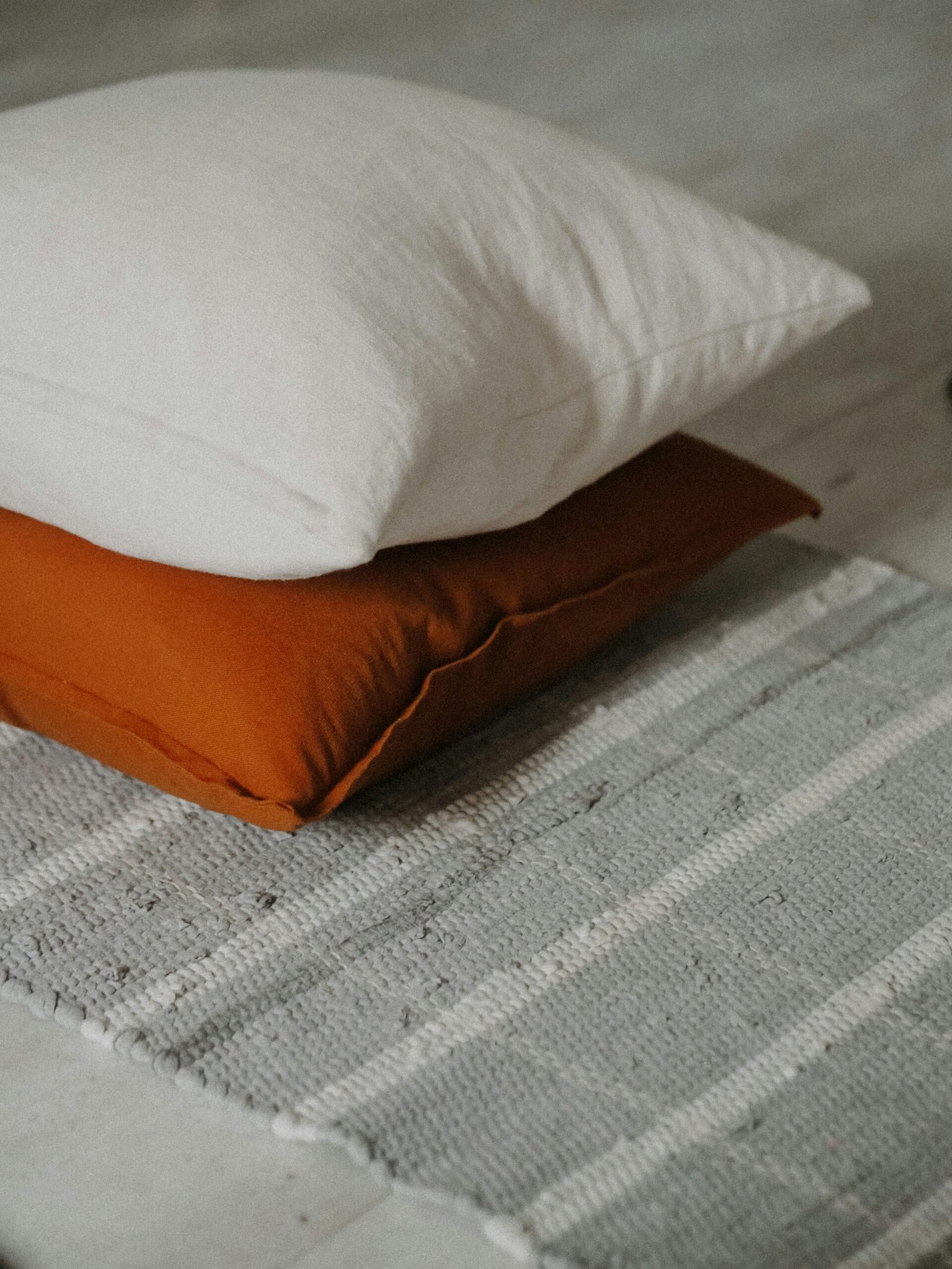
Accent color and contrast points
A thoughtful pop of color or a rich deep neutral anchor can elevate the scheme. Accents don’t have to be loud; a muted olive or charcoal can function as a “pop” in a neutrally dominated room.
Choosing a neutral palette: step-by-step
Select a base, secondary neutrals, and accent neutrals. The base will cover the largest visual areas (walls, large sofas), secondary items are smaller furnishings, and accents are pillows and art.
Step 1: Pick your dominant neutral
Choose the color that will cover walls or large upholstery. Consider natural light: more sunlight can handle darker neutrals; north-facing rooms benefit from warmer neutrals.
Step 2: Add one or two supporting neutrals
These should be distinct enough in value or undertone to create contrast with the dominant neutral. For example, pair warm beige walls with a cool grey sofa for interest.
Step 3: Choose accents
Decide on 1–3 accent colors or deeper neutrals to add punctuation. Keep them consistent across textiles, art, and small decor for cohesion.
Texture toolbox: what to use and where
Texture makes neutrals tactile and visually exciting. Use a mix of soft, hard, matte, and glossy finishes so light interacts differently across surfaces.
Soft textures
Wool, boucle, velvet, chenille, and knit throw blankets create a cozy contrast against smooth surfaces. You should mix at least two soft textures in a living room.
Natural textures
Linen, jute, rattan, wood, and leather introduce organic warmth. They help neutral spaces feel grounded and layered.
Hard textures and finishes
Polished metals, matte ceramics, stone, and glass bring structure and can add modernity or luxury depending on the finish.
Texture placement guide
- Walls: paint finish (matte vs eggshell), wood paneling, or plaster
- Floors: hardwood, stone, or layered rugs
- Large furniture: textured upholstery (bouclé, linen)
- Accessories: woven baskets, ceramic vases, metal trays

Patterns that sing with neutrals
Patterns add rhythm and personality without overwhelming a neutral palette. Mix pattern sizes: one large, one medium, one small.
Pattern types and tips
- Geometrics: modern and structured; keep scale large for bold statements or small for subtlety.
- Florals and botanicals: soften formal spaces; choose muted versions for cohesion.
- Stripes: classic and elongating; use on rugs or throws to add directional interest.
- Prints with texture: herringbone, tweed, and ikat read as both pattern and texture.
Layering techniques for depth
Layer in your neutrals like you would a photograph: foreground (small accessories), middle ground (tables, chairs), background (sofas, walls). Repetition and variation create rhythm.
Practical layering sequence
- Large anchor furniture (sofa, bed)
- Rugs and curtains for grounding and vertical framing
- Secondary seating and side tables for balance
- Lighting to create focal points and layers of illumination
- Art, mirrors, and wall decor to provide scale and direction
- Accessories and plants to finish and personalize
Using contrast without color
Contrast can be achieved with tone, texture, and light even when you don’t introduce bold color.
Examples of neutral contrast
- A charcoal accent wall against soft white trim
- A boucle sofa with a sleek marble coffee table
- High-gloss ceramic accessories on a linen console
Lighting: the secret weapon
Good lighting reveals texture, brightens details, and adds mood. Layer ambient, task, and accent lighting to highlight neutral layers.
Types of lighting and their roles
- Ambient: ceiling fixtures, recessed lighting for overall illumination
- Task: reading lamps, under-cabinet lights for function
- Accent: picture lights, wall sconces to highlight features
Bulb temperature and neutrals
Choose bulbs that flatter your neutral undertone: warm whites (2700–3000K) enhance warm neutrals; neutral to cool whites (3000–4000K) work with cool neutrals. You should use dimming to adjust mood.
Furniture selection and arrangement
Furniture shape and material are as important as color. Choose pieces with interesting profiles and mixed materials for depth.
Material mixing rule
Pair soft upholstery with a contrasting frame — e.g., a plush sofa with a metal-legged coffee table or a wooden sideboard with a marble lamp.
Arrangement tips
Create conversation areas, leave breathing room, and anchor seating with a rug. Symmetry is calming; asymmetry can feel curated and modern.
Wall treatments that elevate neutrals
Walls are more than paint. You can introduce texture or subtle pattern to keep neutrals arresting.
Options for interest
- Wainscoting or board-and-batten painted in the same neutral for tonal depth
- Grasscloth or textured wallpaper in muted tones
- Venetian plaster or limewash for a handcrafted feel
- Painted trims in a slightly different neutral to frame the walls

Art, mirrors, and focal points
Artwork introduces scale, line, and sometimes color. Choose pieces that complement your neutral story and place them intentionally.
Art strategies for neutrals
- Use black-and-white photography or tonal abstracts for a sophisticated look
- Let a single larger art piece act as your anchor rather than many small unrelated pieces
- Consider a gallery rail to layer frames easily if you like to change displays
Mirrors
Mirrors reflect light and multiply texture. A large mirror with an interesting frame can feel like art and double the visual space.
Plants, botanicals, and organic life
Plants add life, contrast, and a hint of color without overpowering a neutral palette. They also introduce texture and improve air quality.
Plant choices
- Textural: fiddle leaf fig, monstera, snake plant
- Trailing: pothos, philodendron for shelves
- Sculptural: cacti, succulents for small accents
Using color accent strategically
You don’t need bright hues to make a neutral room pop. Muted blues, soft olives, or terracotta can act as accent colors that still feel calm.
Accent placement
Introduce accents via pillows, throws, a single piece of furniture, or ceramics. Repeat the accent in 3–4 places across the room for cohesion.
Monochrome and tonal schemes
Tonal decorating uses variations of one color family. This approach can be far from boring if you use plenty of texture and contrast in value.
How to do monochrome right
Layer at least three distinct values (light, mid, dark) and three textures. Add a metallic or matte accent to break monotony.
Room-by-room suggestions
Every room benefits from tailored neutral strategies. Here are practical suggestions for common spaces.
Living room
Anchor with a neutral sofa, layer rugs and textiles, and use a bold textured coffee table. Arrange lighting in layers and include a statement lamp or ottoman.
Bedroom
Use soft neutrals for walls and bedding, and add a darker headboard or throw for contrast. Mix linen, wool, and cotton for a restful tactile palette.
Kitchen
Keep cabinets neutral and add interest with textured countertops, backsplash tile patterns, or open shelving with curated ceramics.
Bathroom
Neutral tiles create a spa-like feel. Use brushed metal fixtures and woven baskets to add warmth and texture.
Dining room
A neutral table with mixed seating (upholstered and wooden chairs) creates a layered look. Consider a textile runner and sculptural centerpiece.
Practical shopping checklist
Use this checklist while buying to keep your scheme cohesive.
| Item | What to look for | Purpose |
|---|---|---|
| Paint color | Test swatches in different light | Base tone |
| Sofa/upholstery | Durable fabric in a dominant neutral | Anchor furniture |
| Rugs | Natural fibers, layered patterns | Grounding and texture |
| Curtains | Linen or cotton in soft neutral | Vertical framing |
| Lighting | Mixed finishes and dimmable bulbs | Layered illumination |
| Accessories | 1–2 accent hues, varied textures | Punctuation points |
| Art | Scale appropriate and tonal cohesion | Focal interest |
| Plants | Different sizes and textures | Life and contrast |

Color temperature and undertones: how to test
Undertones can make two neutrals look totally different. Test on large boards and observe at different times of day.
Quick method
Put paint swatches next to white trim and next to a warm wood sample. If it reads yellow next to white or green next to wood, that reveals the undertone. You should live with samples on multiple walls for at least a week.
Common mistakes and how to avoid them
Knowing pitfalls helps you steer clear of bland results.
Mistake: too little contrast
Solution: intentionally add a darker or lighter neutral in furniture or trim.
Mistake: uniform texture
Solution: mix gloss, matte, soft, and rough surfaces.
Mistake: random accents
Solution: repeat accent colors or materials across the room to create cohesion.
Mistake: poor lighting choices
Solution: layer light types and choose bulb temperatures that flatter your neutrals.
Budget-friendly ways to add interest
You don’t need expensive items to create a curated neutral space. Small, strategic updates can make a big difference.
Affordable strategies
- Swap cushions and throws for textured alternatives
- Add peel-and-stick wallpaper or paint a lower wall panel
- Use thrifted frames and unify them with a single spray-paint finish
- Shop secondhand rugs or layer smaller rugs for richness
When to introduce pattern and color change
Use seasonal swaps or accessories to refresh a neutral base without large expense. This keeps the space feeling current and prevents stagnation.
Seasonal rotation ideas
- Summer: lighter linens, wicker, green plants
- Fall/Winter: heavy knits, darker throws, candles
- Spring: pastel ceramics, fresh flowers
Small space neutrals tips
Neutrals naturally expand small spaces, but avoid sterile results by adding scale and layers.
Small space strategies
- Use one or two strong contrasting neutrals to create depth
- Hang curtains higher than the window to add perceived height
- Keep furniture legs exposed to show floor and increase airflow visually
Large rooms and neutral palettes
Big rooms can feel cavernous if you don’t define zones. Use rugs, furniture clusters, and accent colors to break up the space visually.
Zoning examples
- Living area vs reading nook with different rugs
- Dining space defined by a large pendant and darker chairs
- Use repeated accent colors to link zones
Maintenance and longevity
Neutrals can show wear, so choose durable finishes and fabrics for high-traffic areas and washable textiles for longevity.
Practical maintenance tips
- Use removable, washable slipcovers for furniture
- Treat fabrics for stains and use indoor-outdoor rugs in high-traffic spots
- Keep a consistent cleaning routine to preserve bright neutrals
Quick troubleshooting: what to change if it reads boring
If your room feels flat, make a short list of quick adjustments.
- Add one darker element (throw, pillow, small cabinet)
- Introduce a textured rug or a layered rug combo
- Change a lightbulb to alter warmth and shadow
- Hang a large mirror or a piece of art for scale and focus
Example color palettes and pairings
Here are practical combinations you can try that balance warmth, coolness, and contrast.
| Palette name | Dominant neutral | Supporting neutrals | Accent ideas |
|---|---|---|---|
| Coastal calm | Soft white | Greige, driftwood | Muted seafoam, weathered wood |
| Modern minimal | Cool grey | Charcoal, pale grey | Black metal, concrete |
| Warm shelter | Cream | Warm taupe, caramel | Terracotta, brass |
| Urban loft | Greige | Slate grey, espresso | Olive, matte black |
| Scandinavian soft | Off-white | Light wood, dove grey | Powder blue, copper |
Final checklist before you call it finished
Run through this short checklist so your neutral space reads as intentional and complete.
- Did you include at least three different textures?
- Is there at least one darker or lighter neutral for contrast?
- Are accents repeated in multiple spots?
- Is lighting layered and flattering?
- Do plants or organic elements appear to soften the scheme?
- Does the room have a focal point?
Frequently asked questions
You may have common follow-up questions. Here are concise answers to typical concerns.
Will a neutral scheme limit my future decorating options?
No. Neutral bases are flexible and make it easy to swap accents seasonally or when your taste changes.
How do I choose between warm and cool neutrals?
Look at your room’s lighting and adjacent finishes. Warm woods pair with warm neutrals; cool metals and concrete pair with cool neutrals.
What if I don’t like clutter?
Neutrals pair well with a minimal aesthetic. Focus on fewer, higher-quality pieces and ensure each has texture or interesting shape.
Closing thoughts
A neutral palette is a powerful canvas when you use contrast, texture, and intentional layering. By thinking beyond color — considering materials, light, scale, and repetition — you’ll create spaces that feel warm, sophisticated, and far from boring. Keep experimenting with small changes until the room feels like it reflects your personality and daily life.